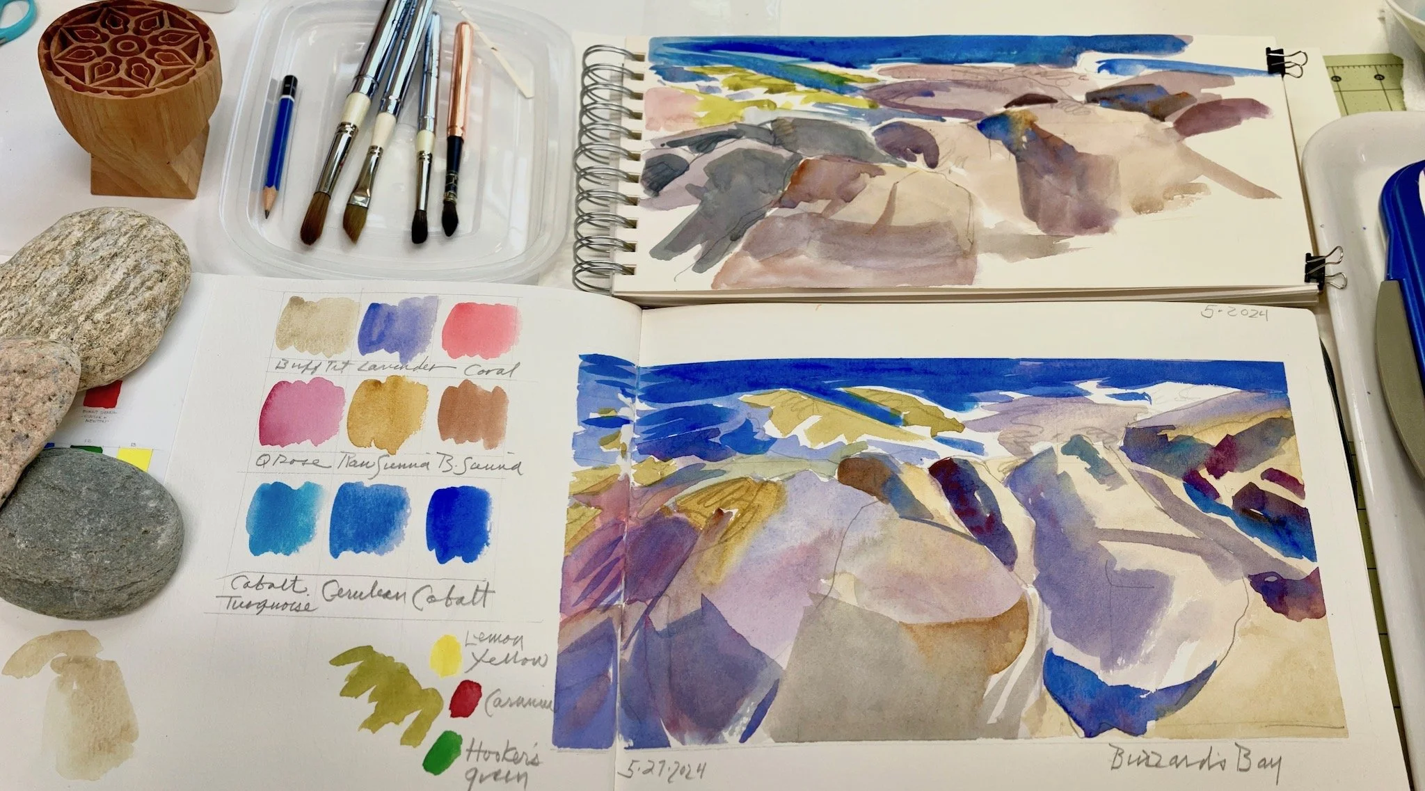
Screenprinted watercolor monoprints can be created with the following materials: stretched white screen and base, a squeegee, transparent base, clear packing tape, watercolors, watercolor brushes and printmaking paper.
Read moreDesigning business cards with Moo
I found Moo’s website with its DIY option for designing my own business cards to be well written and easy to use and my order was delivered within one week. There were two areas of minor difficulty which I will cover in this post.
Moo allows you to choose up to 50 different images per order
A good option especially if you have a content and media diverse portfolio. The front of each card will be the same while the backs of the cards can be different.
Moo offers an array of pre-designed templates or you can create your own design from scratch
I chose the DIY option. After selecting a square corner treatment I selected one of the DIY layout options for the front of my card. The guidelines stress the importance of choosing a font size of 8 pt or larger.
I varied the sizes with the top and largest line at 12 pt and the smallest line at 8.5. I also varied the colors to increase readability. I chose a font which was similar to the font used on my website.
There is also an option for adding a color to the background which I did not use.
The fronts of your cards including the image if you choose to include one, will all be the same.
Preparing image files for uploading
Moo provides their recommended file sizes for each product. I adjusted my files in photoshop at 300dpi.
Begin with a high quality, large file
If you will be shooting your own photos set your camera file size option to large.
After adjusting the resulting photo for color accuracy and sharpness, the file size can then be converted using Photoshop’s Preview feature.
It’s now ready to be uploaded to the Moo site.
Preparing your art image files takes considerable time and patience, but once finished and saved to a desktop folder, you will be able to use these files again for future orders.
Quality over quantity
I selected twelve examples of my figure work, pastel landscapes and printmaking focusing on quality rather than quantity as preparing the files for uploading was time consuming.
Consider cropping some of your images
Mix it up by using only a detail of some images.
The depth of tone and color as seen on your monitor may not match your printed cards.
The first small batch of cards which I ordered as a test run came out a bit darker than I wanted due to the brightness of my screen. For the second order I anticipated that the images tended to print darker than they looked on my screen so I selected a color and brightness setting for each image that looked a touch too light when viewed on my computer screen.
The resulting printed cards were the correct value - just a touch darker than the image viewed on my screen.
Preview & proof before ordering
Preview is the last step before ordering. You also have the option of downloading a proof or having one emailed to you. I highly recommend printing out the proof in order to see the size of your text as it will appear on the product.
Once your order is placed you also have 2 1/2 hours to make changes.
Before you begin: order a sample pack
Moo offers sample packs for their business cards. The sample pack is free and will provide touchable samples of all the options available for choosing the weight, finish, size and corner treatment for your new cards.
While you’re waiting for the sample pack to arrive you can begin to prepare your selection of image files. Once that is done the process will move along quickly.
Strategies for creating a finished pastel from a drawing
I work from live models to create drawings which are usually completed in under 20 minutes. These may or may not have background information which the finished painting will need. I use different strategies to create full compositions including referencing inspirational work which I have collected.
Conte drawings are only a starting point
I liked the energy which this drawing had but there was little in the way of background information to work with. The fabric draped chair was a starting point. Corrections in the drawing also needed to be made.
A second related sketch could be included
There were three drawings on the original 18”x24” sheet of charcoal paper. I decided to include the second drawing into my new composition by moving it to a different position on the new page.
Using a lightbox to transfer the original drawings…
I traced both figure drawings onto a sheet of sanded pastel paper using nupastels. I was pleased with the duo figure comp so far.
I begin by adding color….
with Terry Ludwig’s Portrait Set of soft pastels adding strokes of color which follow the direction and shape of the figure’s forms. My original drawing also had a hint of fabric and that is included as well, but, what next?
Using related source material
Over the years I have collected and saved reproductions of outstanding and inspirational work which I will sometimes reference for inclusion in my own work. The pastel by Degas on the left describes various fabrics and a beautifully curved shallow tub which I decided to indicate at the top of my comp and near the bottom of my work in process. I also curate a Pinterest page containing numerous boards which can also be referenced if needed. https://www.pinterest.com/maryellenriellartstudio/
Indicating background color and info
The tub rim is in and the color scheme of Degas’ pastel begins to influence my developing palette choices.
Window at top corner…
of the Degas pastel, one which I copied in full many years ago as a teenager and which I could almost reference from memory if need be, is included at the top of my composition. I did change the tonalities a bit as well as dropping it closer to the head of the figure than is found in the original work.
The finished pastel
Part 2: DIY dry mounting pastel paper onto foamcore continued...
Newsprint is held to the edge of the sanded paper with a light to medium tack painter’s tape.
Read morePart 1: DIY dry mounting pastel paper onto foamcore using double tack film
Dry Mounting using archival double tack film is, with a little practice, easier than you might expect and you can choose the support of your choice, such as foam core or mat board, to create custom sizes to suit your compositions…..
Read more


